Getting Started
Welcome to the Brand Guidelines project. This document outlines the visual identity, tone of voice, and design principles that define our brand across all platforms.
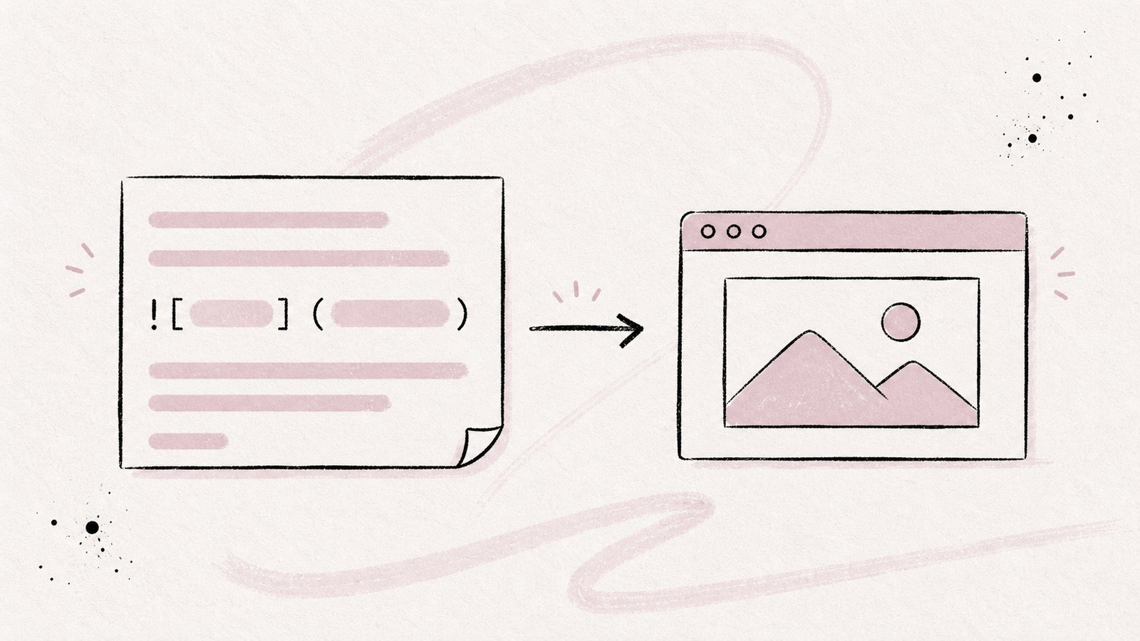
Consistency is key. Every touchpoint, from our website to our product UI, should feel cohesive and intentional. Below you will find the core elements that make up our visual language.
Color Palette
Our primary palette consists of deep neutrals paired with a warm accent. Use #b83b5e for highlights and interactive elements.
// Brand color tokens
const palette = {
  primary:    '#b83b5e',
  background: '#15171a',
  surface:    '#1d1f23',
  text:       '#f0f0f0',
}
Typography
We use Open Sans for display headings and IBM Plex Sans for body text. This pairing balances warmth with technical precision, keeping content readable at every size.
- Headings: Open Sans, extrabold, tight tracking
- Body: IBM Plex Sans, regular weight, 1.7 line-height
- Code: JetBrains Mono, medium weight
"Good typography is invisible. Great typography is unforgettable."
Usage Guidelines
When using the brand assets, always maintain sufficient clear space around the logo. The minimum size for the logomark is 32px. Never stretch, rotate, or apply effects to the logo.
For dark backgrounds, use the inverted variant. On colored surfaces, ensure a contrast ratio of at least 4.5:1 against the background for all text elements.